
 View on Asset Store (opens in new tab)
Package details
- Latest version
- 1.0.1
- Last updated
- First released
- Unity version
- 2022.3.62 or later
- Package size
- 3.7 MB
- Files
- 154
- Favorites
- 151
- Views in the past week
- 374
Price tracking
- Last checked
- Tracked since
- Lowest recorded
- Free on
Keywords

Bloodlines - Dark UI
Bloodlines - Dark UI is a comprehensive UI pack crafted for games with a dark fantasy, gothic, or horror atmosphere.
Affiliate link · Purchases support this site
Price history
Last 6 months
USDAsset preview
1 / 6
Bloodlines - Dark UI screenshot 1
About this asset
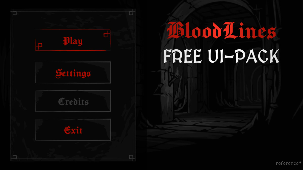
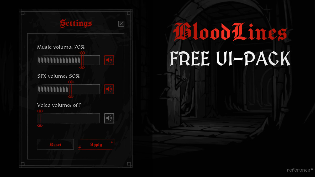
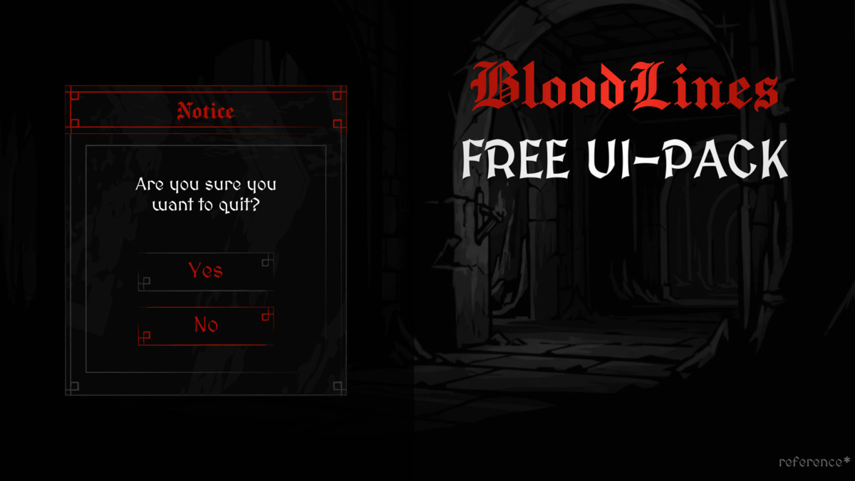
Bloodlines - Dark UI is a comprehensive UI pack crafted for games with a dark fantasy, gothic, or horror atmosphere. The interface combines deep black backgrounds with striking red accents, enriched with runic motifs and decorative elements. The result is a sharp, moody presence — perfect for vampire-themed games, dungeon crawlers, RPGs, or anything carrying a darker tone.
What's Inside
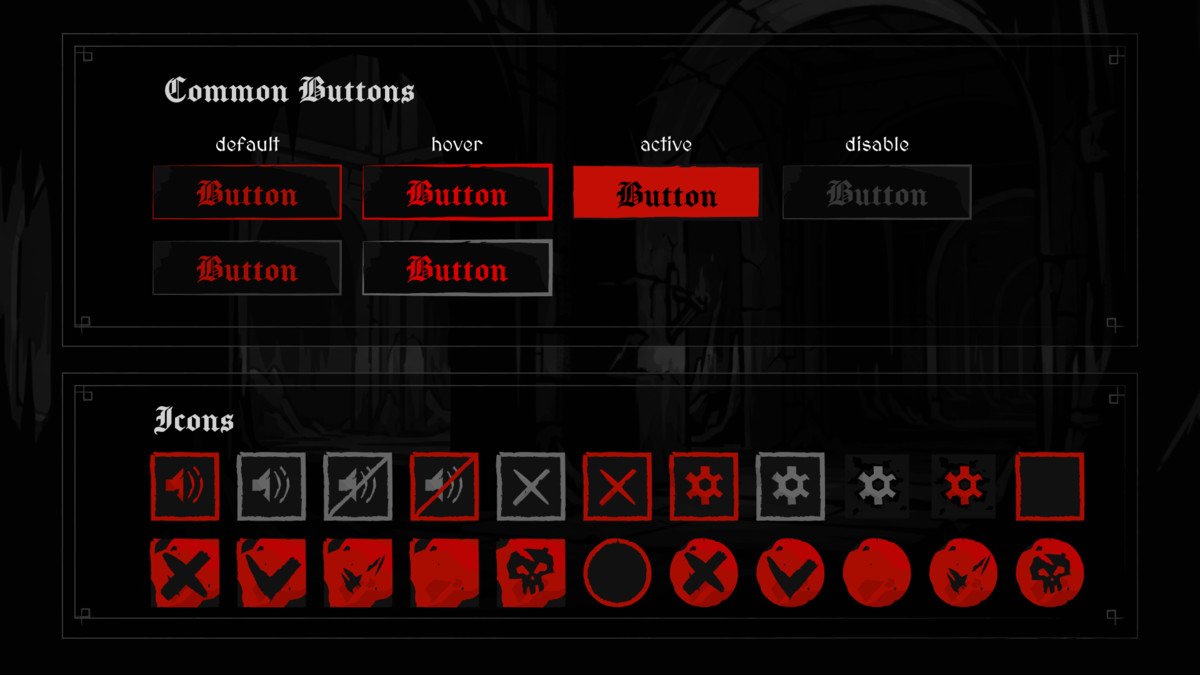
- Buttons - 6 prefabs (3 designs, red/gray themes, default/hover/pressed/disabled states)
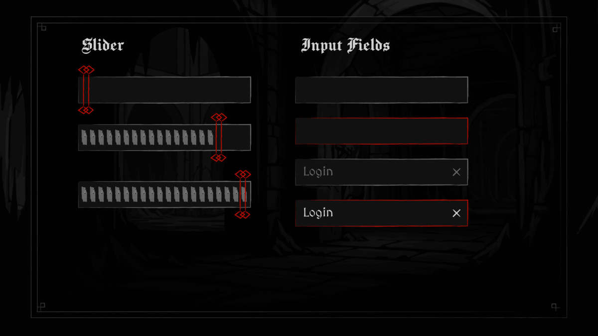
- Sliders - 13 prefabs (horizontal, round, segmented, with rune and handle variants)
- Toggles - 6 prefabs (round and square, across 3 visual styles)
- Input Fields - 4 prefabs (red/gray frames, gray/white text)
- Icons - 4+ icon sets, including ready-made icon toggles
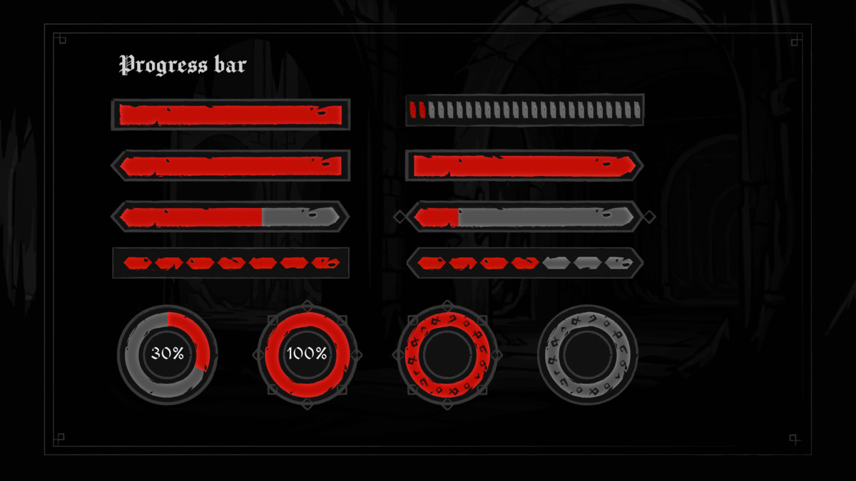
- Progress Bars - rectangular and round texture sets for filled UI Images
- Backgrounds & Frames - decorative gothic panels for menus, HUDs and settings
- Fonts, hover/click sound effects, slider preview animations and a demo scene
All UI elements are available in red or gray theme.
Designed to be easy
- Smart components: 9-sliced sprites for clean, flexible resizing without distortion.
- Prefabs included: everything is pre-configured and organized - just drag and drop onto your Canvas.
- Theme switching: swap sprites to move between the red and gray variants.
A self-contained, production-ready themed UI kit you can drop into any Canvas and ship.
This asset uses the fonts "Manufacturing Consent" and "MedievalSharp" under the SIL Open Font License 1.1 (OFL-1.1). See the Third-Party Notices.txt file in the package for full details and attribution.
From the publisher's Asset Store listing.
Technical details
- Render pipeline: pipeline-independent, sprite-based Unity UI (uGUI); project ships configured with URP.
- Dependencies: Unity UI (com.unity.ugui), TextMeshPro, Unity Audio - all standard Unity packages. No third-party plugins required.
- Texture format: PNG sprites, raster (not vector), authored for 9-sliced scaling. Sprite dimensions are non-power-of-2, as is standard for UI elements.
- Texture / sprite dimensions (pixels):
• Buttons: ~600 x 180 (each interaction state)
• Toggles: 256 x 256 to 280 x 278
• Icons: 256 x 256 to 281 x 278
• Backgrounds & frames: up to 1028 x 1263
• Notice frames: 677 x 181 and 1012 x 181
• Input fields: 556 x 89 and 272 x 270
• Progress bars (round): 330 x 330
• Progress bars (rectangular): ~720-795 x 110
• Progress / health bars (segmented): ~556-698 x 89-99 (plus segment pieces 20 x 50 and 56 x 158)
- Prefabs: 33+ ready-to-use UI prefabs in red and gray themes.
- Animated: Yes (limited) - 3 slider preview animation clips; UI controls use Unity's built-in state transitions.
- Audio: 2 sound effects (.wav) - button hover and click.
- Fonts: 2 bundled open-source typefaces (see third-party note below).
- Demo scene included.
- Minimum Unity version: Unity 2022.3 LTS (2022.3.62f2) or newer.
Compatibility
| Unity version | Built-in | URP | HDRP | Custom |
|---|---|---|---|---|
| 2022.3.62f2 | Compatible | Compatible | Compatible | Compatible |
UI-only kit — no custom render-pipeline shaders. Compatible with Built-in, URP
and HDRP. Demo scene authored in URP; all prefabs/textures are pipeline-independent.
As listed on the Asset Store.