
 View on Asset Store (opens in new tab)
Package details
- Latest version
- 1.2
- Last updated
- First released
- Unity version
- 6000.0.44 or later
- Package size
- 45.8 MB
- Files
- 714
- Favorites
- 2
- Views in the past week
- 3
Price tracking
- Last checked
- Tracked since
- Lowest recorded
- $44.50 on
Keywords

Custom Button | Shader Based UI
- Price drop
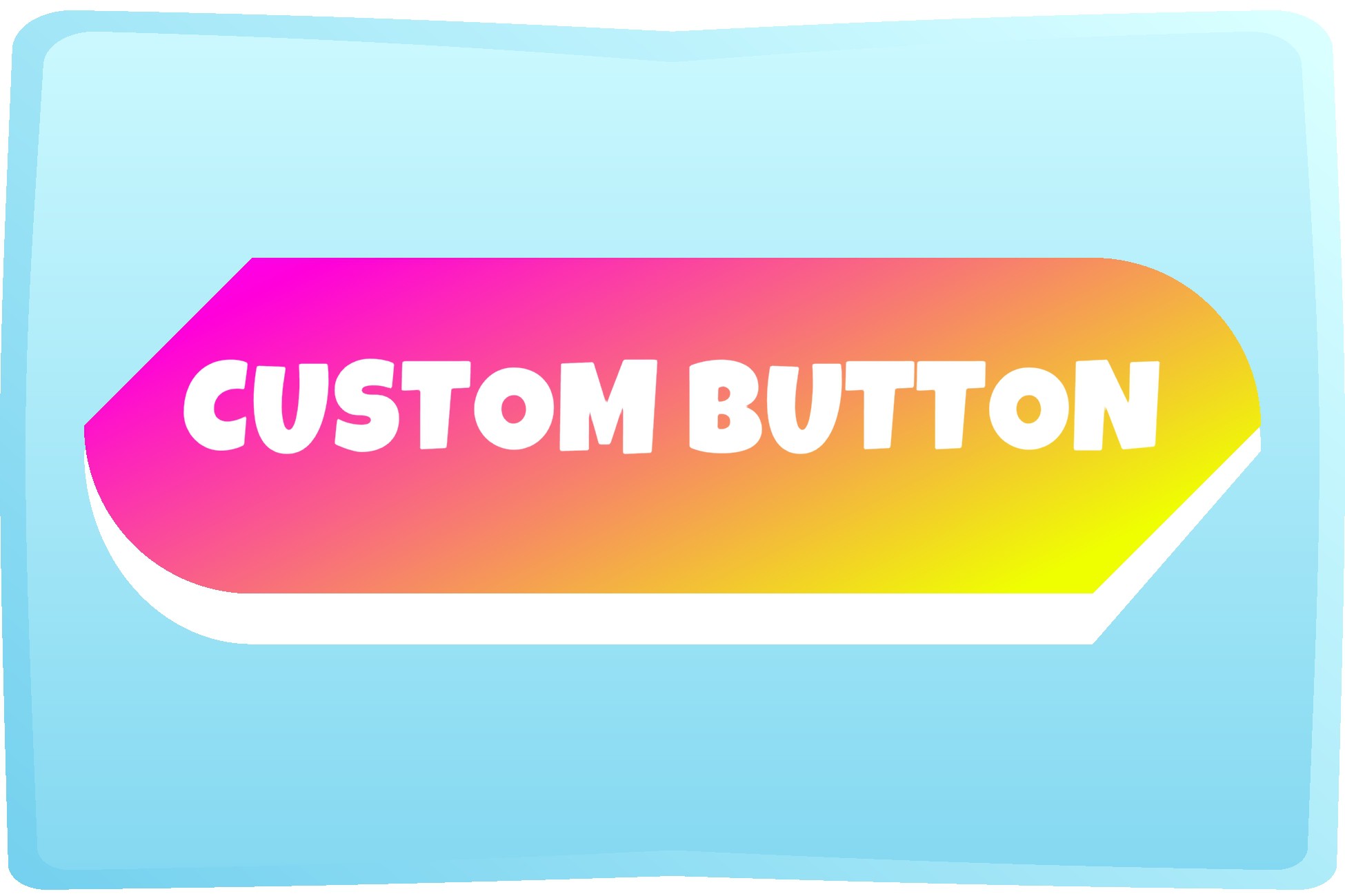
Fully customizable shader-based UI button with hover/click/state events. Normal/Selected/Disabled states, built-in fonts/sounds, 6 editable shapes, outlines, and color gradients for any style.
Affiliate link · Purchases support this site
Price history
Last 6 months
USDAsset preview
1 / 22

Custom Button | Shader Based UI screenshot 1




About this asset
Custom Button is a highly customizable UI component with the ability to make fully unqiue and responsive shader based buttons. There are 6 different interchangeble shapes, solid or gradient colors, 7 build in animations, 5 event handlers, built in fonts and sounds, and customizable hitboxes. Because the buttons are shader based, they are scalable for any device screen size. No image files required. unlimited possibilities for... ANY GENRE.
Why Custom Button was made:
- out of frustration of not being able to find a decent, cheap and good looking UI!
- wanting to stay focussed on creating games and not worrying about the UI
- wanting something that would be friendly for all screen sizes (no pixelation)
- wanted something customizable inside the editor itself so no external application would be needed
- wanted something with sliders... easy to preview changes live!
- wanted nice animations that were easy to modify on the spot
Fonts and Sounds are free to use. The fonts are OFL licensed and the sounds are CC0 licensed... so no attribution required.
Key features:
- Shape Customization: There are 6 shapes available including: Cut, Cloud, Round, Spike, Cloud, and Splash. Each corner can have a different shape if desired. Some shapes have their own settings for desntiy, amplity and intensity - so many dfferent overall shapes can be created. The depth or the offset of the foreground against the background can be set.
- Color and Outline Settings: You can customize the colors of the foreground, background, text and the outlines of each. You can select solid colors, or gradients - or even decide certain faces, or outlines, to be transparent for a cool effect.
- States: 3 built in states (Normal, Selected, and Disabled) with color and text settings for each. Visually toggle between states with ease or manually use events for enhanced control. Choose how animations respond on each state.
- Animation Controls: Multiple built in animations including idle animations (scaling, floating, and wiggling), a rebound animation, hover animations, a click animation, a pressed animation. Choose how much the animation effects the button, the duration of the animation, and the animation curve.
- Hitboxes: Customizable hitboxes (so that theres no glitchy effects with raycasting against animations!) Easily extend hitboxes for mobile buttons or to cover added animations.
- Events: Button events for hover, click and changing of state. A helper script for easily referencing built in functions to change state manually instead of trying to dig through all the public variables. Settings to automatically switch between normal and selected state on click and whether to go back.
- Text and Font Integration: Easily add and manage fonts with the ability to adjust text size and color with over 65 built in OFL fonts. Align the text how you want. Add margins or space between the text or letters.
- Sound and Vibration: Sound on button click and hover with over 85 built in CC0 sounds with the ability to add your own. Enable vibration on mobile devices.
- Easy Setup: Custom Button has been created into a component. Either add the Custom Button component to your game object, or find the Cutom Button in the GameObject creation menu. A default button based on a prefab will be loaded into the scene. This default prefab can be modified.
- Scene examples: There are many scene examples of all of the above. There is a scene example of how to control states in a radio button group. How to disable buttons with another button. There are scenes showing all of the fonts to easily find a likeable font. There are scenes with the sounds for easy preview. There is also a scene showing how the buttons could work in a menu with a popup settings modal.
Licensing (see Third-Party Notices.txt for details):
- Fonts: ALL fonts included in this package are licensed under the Open Font License (OFL), sourced from Google Fonts.
- Sounds: ALL audio files included in this package are provided under the CC0 license, free for use and modification.
This package is governed by the Unity Asset Store EULA, ensuring flexibility in use for both personal and commercial projects.
Visit: https://playya.au for links to how-to videos, walkthrough tutorials, and the trailer.
From the publisher's Asset Store listing.
Technical details
Technical Details
- Render Pipeline Compatibility: Built-in Render Pipeline
- Unity Versions: Compatible with Unity 2020.3+
- UI System: Unity UI (uGUI)
- Shader Type: Custom Shader Graph (no textures required)
- Platforms: Tested on PC, Android, (but should work on Apple)
- Customization: Fully editable in Inspector (no external tools)
- Example scenes + default prefab
Includes:
- 6 Button Shapes (customizable for the shape or per corner)
- 3 States (Normal, Selected, Disabled)
- 7 Built-in Customizable Animations
- 65+ OFL Fonts
- 85+ CC0 Sounds
- Per-state text, color, outline, and hitbox options
- Helper scripts for state management
Requirements
- TextMeshPro: TextMeshPro is included by default in Unity 2018.1 or later. If using an earlier version of Unity (which may or may not be compatible), please install TextMeshPro via the Package Manager. Also, make sure essential TextMeshPro Essential Resources are imported (Window -> TextMeshPro -> Import TMP Essential Resources).
Compatibility
| Unity version | Built-in | URP | HDRP | Custom |
|---|---|---|---|---|
| 6000.0.44f1 | Compatible | Compatible | Compatible | Compatible |
As listed on the Asset Store.